- Published on
- 15 min read
Volcano plots and MA plots: visualizing RNA-seq results in R
- Authors

- Name
- BioTech Bench
- @BiotechBench
Table of contents
- A table can't show you the shape of your experiment
- What you'll learn
- Setup
- The data: picking up from Post 14
- What a volcano plot actually shows
- Building the volcano plot, layer by layer
- The MA plot: the diagnostic your volcano can't give you
- Shrinkage: fixing the fan
- The one-line version: EnhancedVolcano
- How to read these plots without fooling yourself
- What's next?
- Additional Resources
This is Arc 3, Part 16 of the R for Biologists series.
A table can't show you the shape of your experiment
You ran DESeq2. You have a results table. It has twenty thousand rows, six columns, and a lot of scientific notation.
So you do what everyone does: sort by adjusted p-value, look at the top twenty genes, and start googling them. That works, in the narrow sense that you now know twenty gene names. But it tells you nothing about the experiment as a whole. Did dexamethasone produce a handful of enormous, unambiguous changes, or a diffuse shift across hundreds of genes? Are your most extreme fold changes coming from well-measured genes or from genes with four reads? Is the effect symmetric, or did almost everything go one direction?
Those are questions about the shape of a result, and a spreadsheet cannot answer them, because a spreadsheet shows you twenty rows at a time out of twenty thousand. Two plots can answer all of them in about a second of looking. This post builds both.
What you'll learn
- What a volcano plot actually plots, and why the y-axis uses
-log10 - How to build one in ggplot2 layer by layer, with labelled genes
- What an MA plot reveals that a volcano plot hides
- Why fold-change shrinkage changes the shape of your MA plot
- The mistakes that turn these plots from informative into misleading
Setup
Everything here uses ggplot2 plus ggrepel for non-overlapping gene labels:
install.packages(c("ggplot2", "ggrepel"))
library(ggplot2)
library(ggrepel)
The data: picking up from Post 14
In Post 14 we ran DESeq2 on a small airway smooth muscle dataset — human airway cells treated with dexamethasone versus untreated controls — and got a ten-gene results table. Let's rebuild it so this post stands on its own:
res_df <- data.frame(
  baseMean = c(1559.215, 1082.454, 24.453, 490.412, 112.567,
               503.219, 264.498, 66.198, 301.218, 167.291),
  log2FoldChange = c(0.00392348, -0.00582312, -1.12391032, 3.12345912, 4.12398439,
                     -0.08923482, 0.11293419, -0.89234123, 4.31298132, 0.18239812),
  lfcSE = c(0.0827291, 0.0918721, 0.2872391, 0.1872931, 0.2981291,
            0.1128391, 0.1429812, 0.2198712, 0.2192831, 0.1581293),
  padj = c(0.962174291, 0.962174291, 0.000304115, 9.67410e-62, 5.14297e-43,
           0.612934182, 0.612934182, 0.000204115, 3.98412e-85, 0.414532138),
  row.names = c("GAPDH", "ACTB", "IL6", "DUSP1", "CRISPLD2",
                "PPBP", "GPR160", "SPARCL1", "FKBP5", "TGFB1")
)
res_df
         baseMean log2FoldChange     lfcSE         padj
GAPDH    1559.215     0.00392348 0.0827291 9.621743e-01
ACTB     1082.454    -0.00582312 0.0918721 9.621743e-01
IL6        24.453    -1.12391032 0.2872391 3.041150e-04
DUSP1     490.412     3.12345912 0.1872931 9.674100e-62
CRISPLD2  112.567     4.12398439 0.2981291 5.142970e-43
PPBP      503.219    -0.08923482 0.1128391 6.129342e-01
GPR160    264.498     0.11293419 0.1429812 6.129342e-01
SPARCL1    66.198    -0.89234123 0.2198712 2.041150e-04
FKBP5     301.218     4.31298132 0.2192831 3.984120e-85
TGFB1     167.291     0.18239812 0.1581293 4.145321e-01
Ten genes is wonderful for reading a table — you can look at every row and know what it means. It is useless for a volcano plot, which would have ten dots on it and teach you nothing about shape.
So we'll do what we did in Post 17 and scale up to a realistic-sized table. The 2,000 extra genes below are simulated, not real measurements. They exist so the plots look like plots you'll actually make. Here's the simulation, with the reasoning spelled out:
set.seed(42)
n_genes <- 2000

# Expression levels span several orders of magnitude, like a real experiment
baseMean <- 10^runif(n_genes, log10(1), log10(20000))

# About 8% of genes genuinely respond to dexamethasone; the rest don't
is_de <- rbinom(n_genes, 1, 0.08) == 1
true_lfc <- ifelse(is_de, rnorm(n_genes, 0, 2), 0)

# Measurement error shrinks as counts rise. This one line is the reason
# MA plots look the way they do.
lfcSE <- 0.25 + 3 / sqrt(baseMean)

log2FoldChange <- true_lfc + rnorm(n_genes, 0, lfcSE)
stat <- log2FoldChange / lfcSE
pvalue <- 2 * pnorm(-abs(stat))
padj <- p.adjust(pvalue, method = "BH")

sim <- data.frame(
  baseMean = baseMean,
  log2FoldChange = log2FoldChange,
  lfcSE = lfcSE,
  padj = padj,
  row.names = paste0("GENE", sprintf("%04d", seq_len(n_genes)))
)

res_all <- rbind(res_df, sim)
dim(res_all)
[1] 2010 4
That lfcSE line is worth pausing on. In a real experiment, a gene averaging 10,000 reads gives you a precise fold-change estimate, and a gene averaging 3 reads gives you a guess. Standard error falling with the square root of the count is the whole reason low-count genes misbehave — and you'll see that show up in the MA plot later as a very distinctive shape.
What a volcano plot actually shows
A volcano plot puts two different things on two axes:
- x-axis:
log2FoldChange— how big the change is, and in which direction. This is effect size. - y-axis:
-log10(padj)— how confident you are that the change is real. This is evidence.
The reason for the -log10 transform is presentational, but it matters. Adjusted p-values live between 0 and 1, and every interesting gene is crushed into a sliver near zero. Taking the negative log10 flips that: a padj of 0.05 becomes 1.3, a padj of 0.001 becomes 3, and a padj of 1e-85 becomes 85. Small p-values become tall points, so the genes you care about rise to the top of the plot instead of piling up on the floor.
res_all$neglog10padj <- -log10(res_all$padj)
res_all[c("FKBP5", "DUSP1", "IL6", "GAPDH"), c("padj", "neglog10padj")]
              padj neglog10padj
FKBP5 3.984120e-85  84.39966759
DUSP1 9.674100e-62  61.01438943
IL6   3.041150e-04   3.51696216
GAPDH 9.621743e-01   0.01674625
The name comes from the shape: unchanged genes cluster in a wide, low mound around zero, and the significant ones erupt upward on both sides.
Because the two axes are independent, each region of the plot means something different:
- Top left and top right — large change, strong evidence. Your actual hits.
- Bottom middle — no change, no evidence. Most of the transcriptome.
- Top middle — small change, but measured so precisely you're confident it's real. Common in deeply sequenced experiments, easy to dismiss unfairly.
- Bottom left and bottom right — large change, no evidence. This is the region people misread most often. A dot far out on the x-axis looks dramatic, but if it's sitting on the floor of the plot, the fold change is an artefact of a gene with almost no reads.
Building the volcano plot, layer by layer
Step 1: the bare cloud
ggplot(res_all, aes(x = log2FoldChange, y = neglog10padj)) +
  geom_point(alpha = 0.5, size = 1.4) +
  labs(x = "log2 fold change (Dex vs Control)",
       y = "-log10 adjusted p-value") +
  theme_classic(base_size = 13)
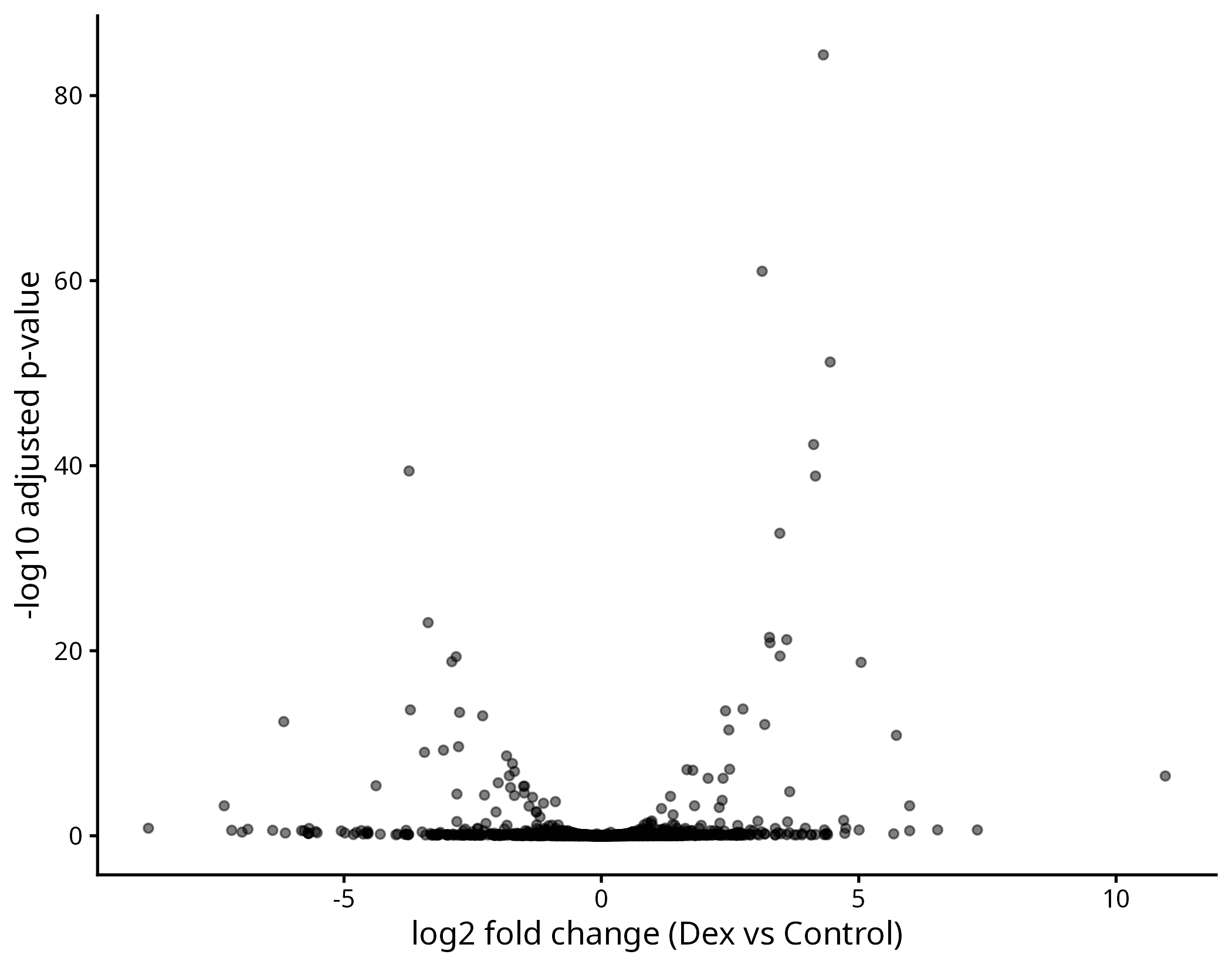
Figure 1. The raw volcano plot. The shape is already informative — a broad base of unchanged genes with eruptions on both sides — but nothing tells you where the significance cutoffs fall.
Setting alpha = 0.5 matters more than it looks. With 2,000 overlapping points, opaque dots turn the centre into a solid blob and you lose all sense of density.
Step 2: colour by significance
The conventional cutoffs are an adjusted p-value below 0.05 and an absolute log2 fold change above 1 (a doubling). We'll encode both in one column:
res_all$significance <- "Not significant"
res_all$significance[res_all$padj < 0.05 & res_all$log2FoldChange > 1] <- "Up"
res_all$significance[res_all$padj < 0.05 & res_all$log2FoldChange < -1] <- "Down"

table(res_all$significance)
           Down Not significant              Up
             34            1942              34
Sixty-eight hits out of 2,010 genes, split almost evenly between up and down. That balance is itself a sanity check — a result where everything moves one direction often means a normalization problem rather than biology.
Step 3, 4 and 5: thresholds, labels, and polish
Now we add the cutoff lines, label the interesting genes with ggrepel so the text doesn't overlap, and set the colours explicitly:
named <- rownames(res_df)
sig <- res_all[res_all$significance != "Not significant", ]
to_label <- unique(c(intersect(named, rownames(sig)),
                     rownames(sig[order(sig$padj), ])[1:6]))
top_genes <- res_all[to_label, ]
top_genes$gene <- rownames(top_genes)
to_label
[1] "IL6" "DUSP1" "CRISPLD2" "FKBP5" "GENE1617" "GENE1654" "GENE0521"
p <- ggplot(res_all, aes(x = log2FoldChange, y = neglog10padj, colour = significance)) +
  geom_point(alpha = 0.6, size = 1.4) +
  geom_vline(xintercept = c(-1, 1), linetype = "dashed", colour = "grey40") +
  geom_hline(yintercept = -log10(0.05), linetype = "dashed", colour = "grey40") +
  geom_text_repel(data = top_genes, aes(label = gene),
                  size = 3.2, max.overlaps = 20, show.legend = FALSE) +
  scale_colour_manual(values = c("Up" = "#C0392B", "Down" = "#2471A3",
                                 "Not significant" = "grey75")) +
  labs(x = "log2 fold change (Dex vs Control)",
       y = "-log10 adjusted p-value", colour = NULL) +
  theme_classic(base_size = 13) +
  theme(legend.position = "top")

ggsave("volcano_plot.png", p, width = 7, height = 5.5, dpi = 300)
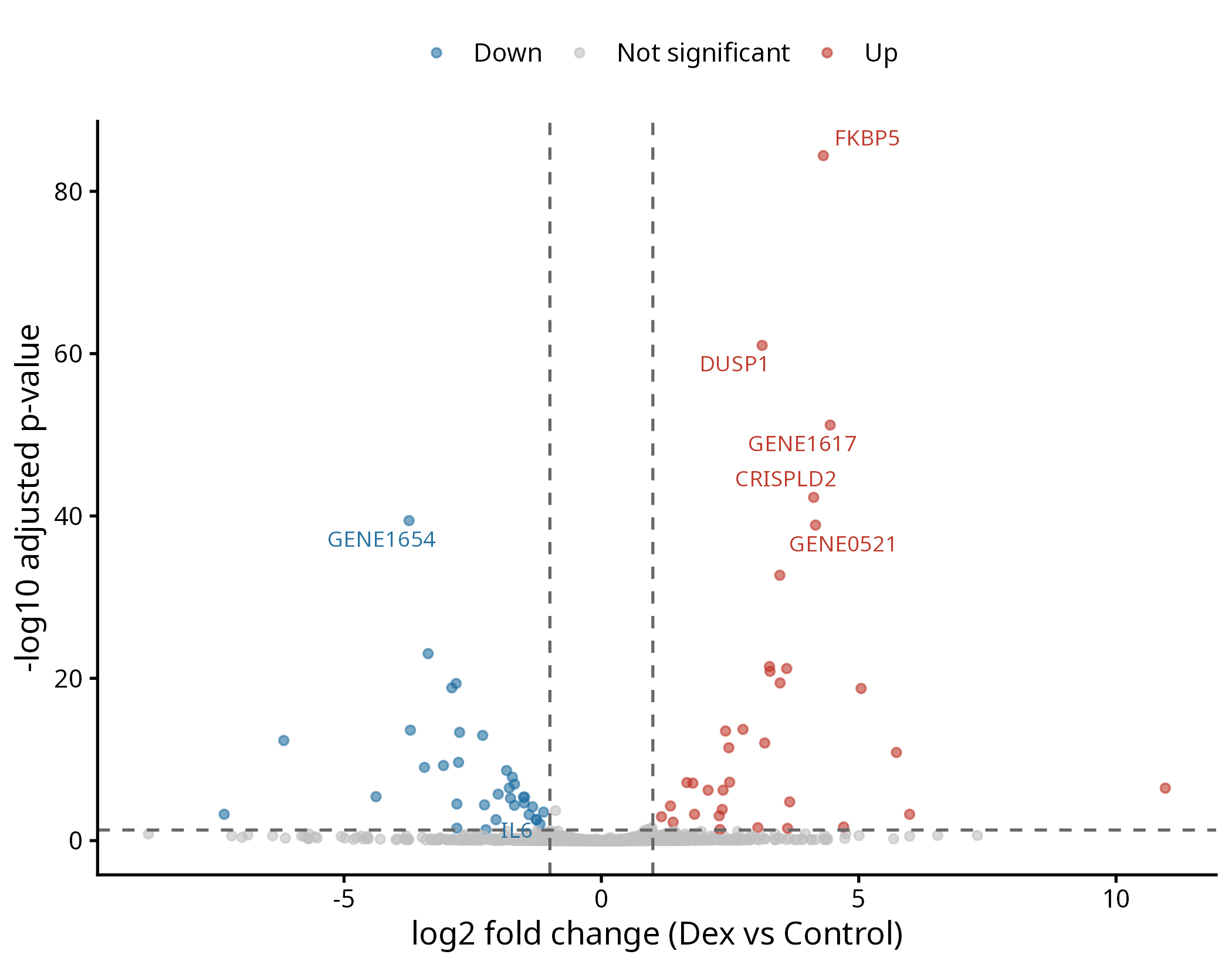
Figure 2. The finished volcano plot. FKBP5, DUSP1 and CRISPLD2 — the known glucocorticoid-responsive genes from Post 14 — sit exactly where they should, high on the upregulated side.
Two details worth stealing. Colouring by a significance column rather than filtering the data keeps every gene on the plot, so the grey background cloud still shows the overall distribution. And labelling a small named subset rather than every significant gene keeps the figure readable — ggrepel will happily place 68 labels, and the result is unusable.
The MA plot: the diagnostic your volcano can't give you
A volcano plot has no axis for expression level. Every dot is positioned by effect and evidence alone, so a gene averaging 20,000 reads and a gene averaging 2 reads look identical. That's a real blind spot, because those two genes are not equally trustworthy.
The MA plot fixes it by plotting mean expression on a log10 x-axis against log2 fold change on the y-axis:
ggplot(res_all, aes(x = baseMean, y = log2FoldChange, colour = padj < 0.05)) +
  geom_point(alpha = 0.6, size = 1.3) +
  geom_hline(yintercept = 0, colour = "grey30") +
  scale_x_log10() +
  scale_colour_manual(values = c("TRUE" = "#C0392B", "FALSE" = "grey70"),
                      labels = c("TRUE" = "padj < 0.05",
                                 "FALSE" = "Not significant")) +
  labs(x = "mean of normalised counts (log10 scale)",
       y = "log2 fold change", colour = NULL) +
  theme_classic(base_size = 13) +
  theme(legend.position = "top")
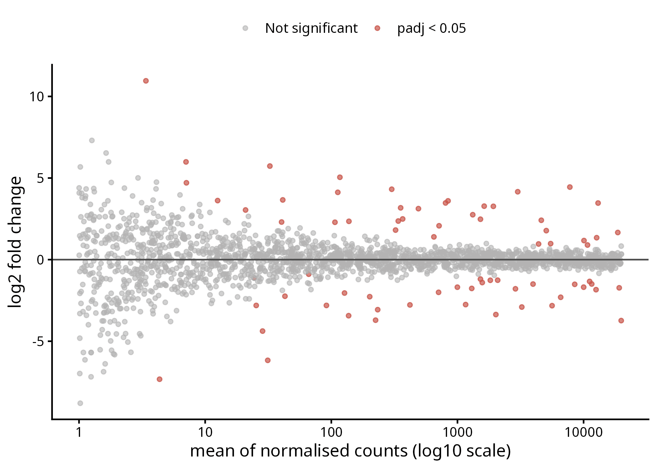
Figure 3. The MA plot. The fan opening to the left is the point of the whole exercise: at low counts, fold-change estimates scatter wildly.
That trumpet shape is what you came for. On the right, where genes are measured with thousands of reads, fold changes hug zero in a tight band. On the left, below about 10 counts, they scatter from −8 to +8. Those extreme values are not biology. They're what happens when you divide small numbers by other small numbers.
Here are the worst offenders in our table:
low_wild <- res_all[res_all$baseMean < 5 & abs(res_all$log2FoldChange) > 4,
                    c("baseMean", "log2FoldChange", "padj")]
head(low_wild[order(-abs(low_wild$log2FoldChange)), ], 5)
         baseMean log2FoldChange         padj
GENE0262 3.390935      10.956846 3.448863e-07
GENE0110 1.022766      -8.800040 1.507756e-01
GENE0141 4.349840      -7.327933 5.696143e-04
GENE1147 1.264335       7.305031 2.324210e-01
GENE1669 1.245612      -7.182123 2.549325e-01
Look at GENE0262: an average of 3.4 reads across all samples, a log2 fold change of 11 — a claimed 2,000-fold increase — and an adjusted p-value of 3e-07. It passes every cutoff we set. It would appear in your significant gene list, get carried into pathway enrichment, and possibly end up in a figure. It is noise.
If you use DESeq2's built-in version, DESeq2::plotMA(res) produces this plot in one line. Building it yourself is worth doing once, because knowing that the x-axis is mean expression is what makes the fan interpretable.
Shrinkage: fixing the fan
The standard fix is fold-change shrinkage. The idea is straightforward: if a gene's fold change is poorly estimated, pull it toward zero; if it's precisely estimated, leave it where it is. Genes with strong evidence keep their effect sizes, and genes built on four reads stop making extraordinary claims.
In DESeq2 you'd call lfcShrink() on your dds object:
res_shrunk <- lfcShrink(dds,
                        coef = "condition_Dexamethasone_vs_Control",
                        type = "apeglm")
Since our table is simulated rather than coming from a real dds object, we'll apply the shrinkage directly so you can see the effect. This is the same principle apeglm uses — weight each estimate by how precise it is:
tau <- 1.0
res_all$lfcShrunk <- res_all$log2FoldChange * (tau^2 / (tau^2 + res_all$lfcSE^2))
A gene with a tiny lfcSE keeps almost all of its fold change. A gene with a large lfcSE loses most of it. Here's what that does across expression levels:
data.frame(
  group = c("baseMean under 10", "baseMean over 1000"),
  n = c(sum(res_all$baseMean < 10), sum(res_all$baseMean > 1000)),
  sd_raw = c(sd(res_all$log2FoldChange[res_all$baseMean < 10]),
             sd(res_all$log2FoldChange[res_all$baseMean > 1000])),
  sd_shrunk = c(sd(res_all$lfcShrunk[res_all$baseMean < 10]),
                sd(res_all$lfcShrunk[res_all$baseMean > 1000]))
)
               group   n    sd_raw sd_shrunk
1  baseMean under 10 498 2.3908191 0.4592579
2 baseMean over 1000 611 0.6354054 0.5825726
That's the whole story in four numbers. For genes under 10 counts, the spread of fold changes collapses from 2.39 to 0.46 — the noise is almost entirely removed. For genes over 1,000 counts, it barely moves, from 0.64 to 0.58. The correction is targeted precisely at the genes that needed it.
Your real hits survive nearly untouched:
round(res_all[c("FKBP5", "DUSP1"), c("baseMean", "log2FoldChange", "lfcShrunk")], 3)
      baseMean log2FoldChange lfcShrunk
FKBP5  301.218          4.313     4.115
DUSP1  490.412          3.123     3.018
And the plot becomes honest:
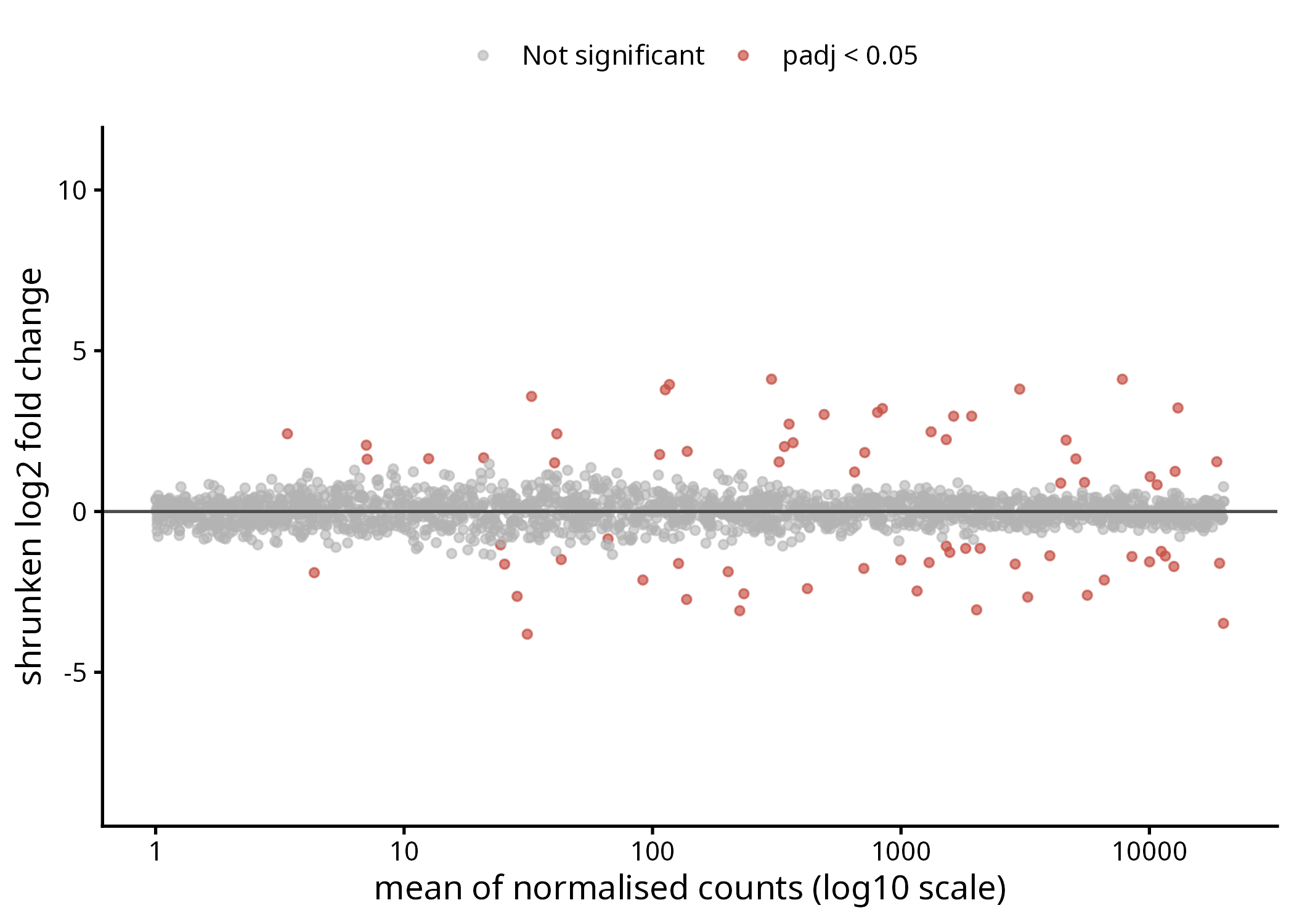
Figure 4. The same MA plot after shrinkage, on the same y-axis limits as Figure 3. The fan is gone; the genuinely significant genes are still there.
Compare Figures 3 and 4 side by side. Same experiment, same genes, same statistics — the only thing that changed is that unreliable estimates stopped shouting. Use shrunken fold changes whenever you rank or threshold genes by effect size. Note that shrinkage changes fold changes, not p-values; significance testing is unaffected.
The one-line version: EnhancedVolcano
Once you understand the layers, there's a package that does all of it in one call:
BiocManager::install("EnhancedVolcano")
library(EnhancedVolcano)

EnhancedVolcano(res_all,
                lab = rownames(res_all),
                x = "log2FoldChange",
                y = "padj",
                pCutoff = 0.05,
                FCcutoff = 1)
It produces a publication-ready plot with thresholds, colours, and labels already handled, and it's genuinely the right tool when you just need a good volcano plot quickly. The honest trade-off: the moment a reviewer asks for a specific change the package doesn't expose, you're back in ggplot2 — which is why it's worth having built one by hand first.
How to read these plots without fooling yourself
Thresholding on fold change alone. This is the most common error, and our own data demonstrates the cost:
res_all[c("SPARCL1", "IL6"), c("log2FoldChange", "padj", "significance")]
        log2FoldChange        padj    significance
SPARCL1     -0.8923412 0.000204115 Not significant
IL6         -1.1239103 0.000304115            Down
SPARCL1 has a smaller adjusted p-value than IL6 — stronger statistical evidence — but a log2 fold change of −0.89 instead of −1.12. Our abs(log2FoldChange) > 1 cutoff throws it out and keeps IL6. That cutoff is a convention, not a law of biology, and a 1.85-fold change in a transcription factor can matter far more than a 4-fold change in something inert. Use the threshold to focus attention, not to define truth.
Reading the bottom corners as findings. GENE0262 above is the cautionary tale: extreme fold change, near-zero counts, and a p-value that passed. If a gene is exciting and sits low on the volcano or far left on the MA plot, check its baseMean before you get attached.
Labelling only the genes that fit your story. You choose which genes get labels, and that choice is invisible to the reader. Labelling your five favourite hits while leaving the equally significant gene that contradicts your model unlabelled isn't a visualization choice, it's an argument. Label by an explicit rule — top N by adjusted p-value, or a pre-specified gene set — and say what the rule was.
Asymmetric axis limits. If your x-axis runs from −2 to +8, upregulation gets four times the visual space. Unless you have a reason, use symmetric limits: xlim(c(-max(abs(res_all$log2FoldChange)), max(abs(res_all$log2FoldChange)))).
Treating padj = NA as "not significant." DESeq2 sets padj to NA for genes it filtered out before testing — usually very low counts, or extreme outliers. Those genes were never tested. They're absent from your volcano plot entirely, which is fine, but "not significant" and "not tested" are different claims and shouldn't be reported the same way.
What's next?
You can now see the shape of your experiment: how many genes moved, in which direction, how strong the evidence is, and whether your extreme fold changes are real or artefacts of low counts.
The next question is what those genes mean. Sixty-eight significant genes is still a list of names, not a biological insight. In Post 17 we take that list and ask which biological pathways it implicates, using clusterProfiler.
Additional Resources
- DESeq2 vignette — the shrinkage and MA plot sections in particular
- Love MI, Huber W, Anders S (2014). Moderated estimation of fold change and dispersion for RNA-seq data with DESeq2. Genome Biology, 15:550. doi:10.1186/s13059-014-0550-8
- Zhu A, Ibrahim JG, Love MI (2019). Heavy-tailed prior distributions for sequence count data (the
apeglmshrinkage estimator). Bioinformatics, 35:2084–2092. doi:10.1093/bioinformatics/bty895 - EnhancedVolcano on Bioconductor
- ggrepel documentation — for when your labels overlap
Keep reading
Gene ontology and pathway enrichment analysis in R with clusterProfiler
You ran DESeq2 and got your list of differentially expressed genes. Now what? Here is how to use clusterProfiler to find out which biological pathways are actually changing in your experiment — with real code, real output, and real plots.
DESeq2 vs edgeR: which one should you use and does it actually matter?
An honest head-to-head comparison of DESeq2 and edgeR. Learn the differences in their normalization, statistical tests, and run-times, and see if they actually give different biological answers.
Differential gene expression with DESeq2: a step-by-step tutorial
A step-by-step practical guide to performing differential gene expression analysis in R using DESeq2. Learn how to load counts, run the analysis, and interpret your results table.