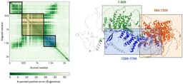
AlphaFold3 can predict your protein's 3D structure from a sequence in minutes — for free. Here's how it works, how to use the server, and what those confidence scores actually mean.
ggplot2 turns your summarized qPCR data into publication-ready figures in a dozen lines of code. Here is how to build dot plots, bar charts, and multi-panel figures — and export them at 300 dpi without touching GraphPad.
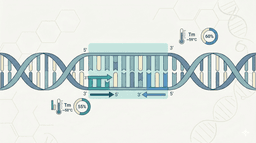
A practical guide to designing PCR primers that work — covering the rules every bench scientist should know, plus an honest comparison of the best free web tools.
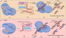
SpCas9 dominates CRISPR, but it has real constraints. Cas12a uses a T-rich PAM, cuts in a staggered fashion, processes its own guide RNAs, and opens up AT-rich targets Cas9 cannot reach. This post covers the full Cas12 family, the Cas12a mechanism, and a complete head-to-head comparison to help you choose the right tool.
dplyr turns data wrangling from a click-and-copy nightmare into five readable lines of code. Here is how to filter, summarize, and reshape your qPCR data without touching Excel.