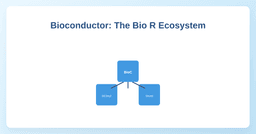
If R is a smart phone, Bioconductor is the App Store for biology. This post explains why bioinformatics has its own package repository, why it’s better than CRAN for scientists, and how to keep your biological analysis reproducible.
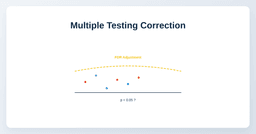
If you test 20,000 genes at once, you’ll get 1,000 "significant" results by chance alone. This post explains the Multiple Testing Problem and how to use the p.adjust() function in R to calculate False Discovery Rates (FDR) and protect your results.
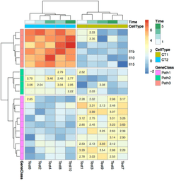
Raw log2 CPM values are hard to interpret as a table. A heatmap fixes that — but the defaults are ugly. Here is how to build a publication-ready gene expression heatmap in R with pheatmap, including clustering, color palettes, and sample annotations.
Raw counts from RNA-seq are not comparable across samples without normalization. Here is why that matters, what CPM and TPM actually do, and how to normalize in R.
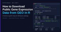
GEO has thousands of published RNA-seq datasets — including the one from that paper you just read. This post shows you how to pull any GEO dataset into R with GEOquery, extract the count matrix and sample metadata, and save both as CSVs for downstream analysis.